Branding
31/10/2022

How to Rebrand a Company (and how not): A Huddle Creative Step-by-Step Guide

What’s in a brand?

A brand is much more than just colours, logos, fonts and all the stylistic good stuff.

A brand is your business identity. In other words, it’s the image you wish to portray to the world. It communicates who you are, what you do, what your promise and mission is, what your company stands for and the values it’s built upon.

Recognisable and effective branding promotes your brand out into the world, connects you with your customers, enables you to capture a piece of the market, or break into a new market, and edges you ahead of competitors.

And though the visual identity aspect of branding is important, what’s more important is how that reflects the very core of the business itself: Who it is, what it does, how it does it, and why.

What is rebranding & its purpose?

Rebranding is both a marketing and branding strategy where a new brand name, concept, design or brand identity is created to replace or update an already established brand.

The purpose of rebranding is simple: Businesses and industries evolve. For a business or brand to stay competitive and relevant it too must showcase its own evolution both through the brand, and its brand design (also known as its visual identity).

Because of this natural evolution, which could involve changes in positioning, values, or missions, there are a multitude of reasons why a brand may choose to rebrand. Some are good, some are terrible (we’ve listed the right and wrong reasons below), but at its heart rebranding can rejuvenate businesses of any shape and size by modernising them, differentiating them, and reinventing them.

Right (and wrong) Reasons for a Rebrand

Rebranding is more than choosing a new logo, name and colour scheme. Rebrands can come with significant risks, like audience disconnect, loss of market standing, and potentially huge impacts on sales and industry leadership.

A good example is Royal Mail who in 2001 attempted to completely overhaul their brand to become Consignia. The decision cost them £3million to correct, and they suffered a complete loss of brand identity, industry standing and audience connection because nobody quite understood who they were or what they did.

Before rushing in, businesses and brands must understand the reasons behind why they want to rebrand. If it’s poor sales or low brand awareness for example, these are two things that can be rectified through business strategy analysis, a brand strategy refinement, marketing strategies, or deeper research.

To help, we’ve listed four right reasons and four completely oh no don’t do it reasons, with real life examples, below.

The right reasons

  1. Rebranding to stand out from the competition

Rebranding to leverage brand uniqueness and step out of the shadow of competitors is one of the correct reasons for rebranding. Generic names, poorly designed logos, or even failure to capture brand personality within the visual brand identity will restrain the business from filling its potential and claiming a share of the market.

Why? Because there’s no opportunity for your audience to resonate with your brand and therefore connect with it.

This is where the power of rebranding comes in: It enables your business to differentiate from competitors by showing off what’s unique about it, and why it’s worth opting for over others.

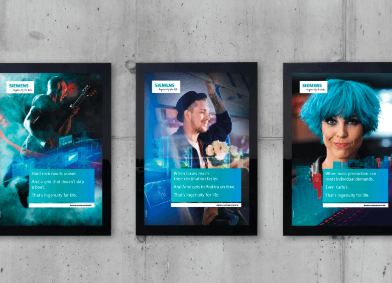
Siemens is a technology company who got their rebranding right. Their identity before looked tired and too corporate, with stock image pictures of businessmen in suits and a logo that was simply their name in a standard font with not much else.

Fast forward, and Siemens realised the technology market was growing with the introduction of brands like Huawei and LG, and so needed to differentiate themselves. Admittedly they didn’t change much about their logo, keeping the same font and colour, but they added a white box around it and underneath added their brand ethos: Ingenuity for life.

The addition of their ethos was powerful: It enabled Siemens to speak directly to the audience they needed to and outrightly promoted their brand promise twofold: To always deliver ingenuity forever (for life) and also in the everyday (for life). Siemens further displayed this connection by running a marketing campaign that featured people from all backgrounds and diversities in different environments, such as music gigs, DJs and female tech entrepreneurs.

Capture.PNG

2. Rebranding to breathe new life into tired designs

In this digital age of gorgeous graphic design, animated backgrounds and even technological leaps like AR and VR, Comic Sans 1999 Windows Frontpage branding sticks out like a sore, consumer off putting thumb.

Tired designs, dullish colour palettes, Clipart logos and failure to diversify or innovate can all leave brands behind like a desolate 1970s amusement arcade that got overshadowed by Alton Towers.

Rebrands are necessary for dated designs because something in the business is bound to have changed, whether it’s a new mission or value, or even a new product range or position. If nothing’s changed, then a rebrand can still be necessary to revolutionise the brand’s identity, drag it into the twenty-first century and show its audiences that it is evolving with the world around it.

One such example is Global Lightning Protection Services. This industrial firm specialises in lightning protection for the aerospace, construction and wind industries which is actually, when you think about it, pretty cool.

Unfortunately their original branding was not very cool. For a start their logo was what appeared to be a metallic beach ball with a lightning icon on it and their entire name in a Wordart font. There was no colour scheme, and nothing that really emphasised the fact that by nature the business was always evolving as technology and products around it did.

Capture.PNG

Thankfully they opted for a rebrand and it paid off. Their new logo is quite frankly badass and dramatic, and uses a cutting strike of a lightning bolt to tell everyone exactly what it is they work with. They’ve shortened their name to GLPS, a much easier brand to identify and refer to, and even added their brand promise “empowering you to take charge” which is a clever use of a semantic field to create a play on words for both the mission of the business, and also why consumers need to use them.

3. Rebranding to change positioning

Brands serve to connect your business with your ideal customers. But if you’re noticing that who you’re selling to is starting to differentiate entirely from who you want to be selling to, and you’re being associated with an incorrect brand image, your brand may need to reposition itself to appeal to the correct, or desired, audience.

One notable example of this is luxury British fashion house, Burberry. In the early 2000s, Burberry was in a bit of a slump. The brand with a 150 year heritage of fitting Lords and Ladies of the manor found themselves instead delegated to connotations of “gang wear” as predominantly white groups of males starting wearing the brand and then causing trouble at football away days. Things got so bad that a pub in Leicester famously banned anyone wearing Burberry, and the iconic red, white and beige checked scarf could be quite openly side eyed on the street.

In 2009, creative director Christopher Bailey took charge and decided the brand needed a rebrand, and fast. It needed to keep its luxury heritage, but it needed to show some kind of revolution. His answer? Repositioning.

Burberry used new product design to overhaul its tired classics and instead introduce new, sleek silhouette styles and for the first time, a line of female swimwear, both decisions which were aimed at enticing a much younger, much more fashion conscious female audience.

Some clever brand sponsorship deals later with clean as a whistle, teenage role model Emma Watson and fashion model Cara Delevingne (who stepped out in a Burberry coat in the centre of New York) cemented the rebrand. All of a sudden Burberry wasn’t gang wear. Burberry was edgy, high couture fashion and a decade on, that’s still exactly how it’s perceived.

4. Rebranding because of brand evolution, merger or acquisition

This is another important reason. When two brands or businesses merge they need to reinvent themselves. Not only will repositioning need to happen as the now merged company looks to appeal to two pre-existing audiences, the original mission and values of the merged companies may have changed or become streamlined.

When that happens, the branding needs to reflect the changes happening behind the scenes and that’s where a rebrand becomes necessary. Letting two brands sit side by side to try and appeal to the same audience with the same vision will ultimately cause confusion, disconnect and failure.

Two brands who faced this problem were tech giants Computer Sciences Corporation and Hewlett Packard Enterprise Services. Both companies specialised in providing IT services, but because they had previously been competitors - as opposed to innovators - the businesses needed to show unification across the brand in order to successfully carry across their existing audiences and values.

So, rather than sit side by side, they both took the leap and rebranded into DXC Technology. The new branding solidified them as a solitary industry leader and their rebrand, which was designed around their mission: “To help clients succeed in the face of accelerated innovation” represented just how committed to innovation they truly were.

The wrong reasons

  1. Boredom

Boredom is perhaps the worst reason for rebranding, ever. Many businesses or brands end up spending significant amounts on rebranding - and then getting it wrong - all because someone is getting tired of looking at the same logo and colour scheme and longs for shiny new things.

However, often with branding, shiny new things aren’t the answer unless there is a definitive reason (like the logo coming out of Microsoft 2000 Clipart). Though internally some departments may long for a change, it’s unlikely that consumers will because of their longstanding or preferred associations between the brand and a logo or colour scheme.

A classic example of boredom backfiring was the football team Leeds United. Leeds, a team with significant heritage, one day decided to sanction a change in brand identity that would see their historical coat of arms eradicated and instead replaced with a generic icon of a man thumping his chest.

Capture.PNG

It went as expected: Horribly. Over 77,000 Leeds fans protested the new logo and it was mocked openly on social media for being better suited as an advertisement for indigestion tablet, Gaviscon.

The damage was minimal apart from some red faces and refusals to buy the kit if ever it came to fruition (which would have eventually impacted profits), but had this been a different industry such careless and restless thinking could have been catastrophic. Leeds PR ended up reversing the changes within days, and the team has since done a minor, much cleaner, brand refresh.

2. Crisis management

In money troubles? Had skeletons fall out of the closet? Fending off bad press for brand mismanagement or mistakes?

Do not rebrand.

Rebrands that come in the midst of a catastrophe are seen through faster than your partner who knows you’ve watched something without them.

Often a rebrand in the face of a crisis will only tarnish the brand or business further as it will be seen as trying to distract from its bad press or shirk its accountability. Instead, face up to the trouble swirling around the brand, take responsibility and display how the lesson you’ve learnt from the issue is going to completely rehaul the brand or business so it can come back bigger and better.

Wells Fargo, one of America’s oldest and most loved financial services brands learnt this the hard way when it was revealed that they had been fiddling their sales figures by opening millions of fraudulent accounts.

In an attempt to overcome the scandal they tried to rebrand it out of the public stratosphere, swapping their management, launching diverse advertising campaigns and even updating the logo that best reflected their heritage.

Their message was an attempt to persuade customers they’d built back better, but in 2019 the rebrand was seen as nothing but the distraction many suspected it of being after more evidence revealed Wells Fargo was still paying checks drawn on the fake accounts.

3. Ego

In branding, an oversized ego can do oversized amounts of damage. If the brand or business desperately needs a rebrand, a reposition or a complete overhaul, an ego can prevent this from happening and sentence the business to despair. Whereas on the other hand, if a new owner takes over, decides they know best and then completely shakes the brand or business out of all recognition, that can also do just as much damage as failing to revolutionise.

When it comes to branding, egos need to be left outside the door and even more so if a rebrand is really just an excuse for a new owner, partner company, or Director to come in and try to make their mark.

Football team Cardiff City were another team who had a rebranding nightmare under their new leadership. When new owner Vincent Tan took over he decided that the team needed a complete brand identity overhaul. Known as the ‘Bluebirds’ for their entire legacy, Tan decided that could go and instead changed the entire team colours from blue to red to better represent Wales. He also removed the bluebird from the logo and replaced it with the Welsh dragon.

Capture.PNG

What he hadn’t planned for was just how much he was going to go against a fundamental rule of rebranding: Audience association and connection. Significant fan outrage led to the logo and team colours once again being reverted back to blue in a new, much more stylish design.

4. To save floundering sales

In the face of declining sales, reinventing your brand might seem like a wise idea. After all, it generates buzz, which generates curiosity, which may generate revenue by new audiences being enticed to try it, or existing audiences willing to see what’s different.

However, if nothing has changed under the surface: That is, if your image has changed but your company’s mission hasn’t, or you look like you’ve repositioned when really you’ve just refreshed, those rebrands will become temporary highs and costly, addictive cycles of repetition.

Subway is one such brand learning that lesson. After the arrest of their spokesperson, Jared Fogle in 2015, and yearly declining sales since 2014 due to other fast food chains bringing out fresh sandwich options, they opted to rebrand. They released a new sleeker look in 2016 in conjunction with the Olympics, and it went well, renewing global interest and stabilising sales figures.

However, 4 years on and 2020 sales figures saw Subway close more than 1,000 stores in the United States, and only hold 24,798 stores globally - its lowest amount ever. In the wake of the COVID19 pandemic, Subway has closed 2,000 more stores and even took to selling grocery items at some locations to try and take advantage of consumer need when supermarkets ran short.

Rebranding in the wake of declining figures is a temporary, expensive fix: And not an advisable one.

Rebrand vs Refresh: How to tell which one you need

You may have noticed us using two terms throughout our guide so far: Rebrand and refresh.

This is where we do a record scratch, because rebrands and brand refreshes are completely different things.

The best way to quickly define the differences between them is to think of them as home improvement events. A brand refresh adds a new lick of paint to the wall. A rebrand knocks down the wall to make room for a new extension.

In other words: A rebrand is where a brand takes itself apart and completely reinvents itself, like we’ve seen with the above examples of GLPS, Burberry and even the failed Cardiff City FC attempt.

That’s why before going any further it’s imperative to decide which one your business needs. If your logo just needs a quick update, or you want to tweak the colour scheme, you’ll be needing a brand refresh and you can find out more about them and how to do one here.

On the other hand, if your business has:

  • Changed its positioning
  • Changed persona
  • Changed or chosen new values
  • Altered from its original mission or purpose
  • Undertaken a merger or acquisition

It’s probably time for a complete rebrand, which will involve, among other things:

  1. Altering the look, feel and tone of your brand so that it bears only minimal resemblance to the existing brand assets in order to influence, change and update consumer perceptions.
  2. Delving deep into the brand ethos, strengths and weaknesses as well as reanalysing your target audience's desires, wants, needs and pain points to reposition the brand and its products or services in such a way that it meets those needs.
  3. Undergoing market research and developing new customer personas. If your brand positioning is changing to attract new customers, this is essential. If your brand won’t be targeting new customers, this step still needs to take place as you’ll need to craft updated messaging in line with the rebrand that still appeals and resonates with your existing customers.
  4. Crafting an entirely new visual identity.

And to learn how to do all that, you’ll need to read on.

How not to rebrand

Before we tell you how, we’re going to go one better and tell you how to not. Why? Because it will make the process much simpler if you know which pitfalls to avoid, and it will shape your actual rebranding strategy into something much more cohesive.

Here are our five rules:

1. Don’t cut corners

Branding is 80% strategy, 20% implementation. It is a strategic decision, not a stylistic one. Investing time up front, and doing things in a considered way will always save time in the long run. This cuts the risk of losing your hard-won brand equity, as happened to Yahoo/AOL/Oath/whatever they’re called today after their mind-numbingly complicated takeover by Verizon last year.

2. Don’t copy anyone. Be yourself.

Despite the fact we all know branding is about differentiation, it’s amazing how many companies end up looking and sounding alike. A good rule of thumb is that if you’re struggling to identify what makes you unique then you’re probably trying to convey what you think you should be, rather than what really matters.

3. Don’t try to be too clever

While you want to be different, be careful not to annoy anyone by getting too clever. Design systems and conventions evolve for a reason. You have to know the rules in order to break them, and there’s absolutely nothing more irritating than a style-over-substance brand. Stay simple.

4. Develop a solid brand platform before doing anything

Let your values and position inform every decision you make about the brand experience. If you’ve got any uncertainty about who you’re actually for and why you’re even in this, then bad news, it’s not going to get any clearer after a rebrand. Conversely, in getting clear on your values, you may also find you just need to double-down on everything you’re already doing.

5. Don’t go it alone

We all have blind spots when it comes to our own branding. Mozilla were guilty of navel gazing when they decided to replace the ‘l’s in their name with forward slashes for no discernible reason. Getting support from a professional outfit who can help you see yourselves in a fresh light is essential.

How to Rebrand Step-by-Step using 5 Pillars of Rebranding

Now we’ve established how not to do a rebrand, we can get onto the happier stuff of how to craft a rebranding strategy that will lead to a successful outcome for your business, your audience and your new brand.

Following these five key steps will put you in the best stead to successfully rebrand, and reap the benefits.

  1. Reestablish your brand's audience and market.

Remember how Burberry ended up realising that the audience they were targeting, and the audience that were buying from them, had somehow vastly differed? The first step in their rebranding strategy was to reestablish their preferred audience, and that’s a blanket first step for any brand taking efforts to revolutionise.

Reestablishing your brand’s target audience happens by acquiring information through market research and focus groups, and then analysing the data. Also, utilizing Excel alternatives can streamline data management and analysis, enhancing the efficiency of the process.

Once you can establish who’s buying from you, and who isn’t, you can begin to compare this against your initial target market.

If there are stark differences, use those to start rebranding your company to connect once again with your ideal customers. Or, alternatively, use the information to better position your brand toward your new audience if that’s who you’d like to continue targeting.

2. Redefine your company's vision, mission, and values.

Quite often brands need to do a rebrand because something fundamental has changed, and it’s usually one of their founding fathers: The mission, the vision or the values.

If you’re considering undertaking a rebrand, even if you think that neither of the above have altered, it’s worth reevaluating them anyway. You may find that elements of the rebranding process actually require a change, for example putting the value of innovation front and centre for the first time may require the businesses overall vision to be changed.

Foundations change as a company grows, so as a reminder, analyse the following three areas:

Vision

Aka: What are you doing?

The business’s vision is its guiding light. It influences all actions the company takes, so it’s essential that everyone, from C-level to employees, have a firm understanding of it and are working in sync. If the vision has changed, the brand identity needs to reflect that change so that it can continue propelling the business toward the same futuristic outcome that everyone else is working toward.

The vision has more sway on a rebranding process than you might think, because it will affect and decide how everything is presented, so take the time to ensure it aligns.

Mission

Aka: How are you doing it?

If your what has changed, so will your how. The business’s mission supports the vision by roadmapping exactly how the business is going to achieve what it’s set out to.

Even if your vision remains the same but your mission has altered, your brand messaging needs to be brought up to speed to reflect that change. Likewise, if the mission and the vision are completely out of sync, both need reevaluating and then illustrating, fast.

Values

Aka: Why are you doing it?

Your business’s values are your purpose. They define why you’re working every day to support the business’s vision, and why the business’s mission exists.

But as brands and businesses evolve and grow, some values may become less relevant than others. If that’s happened, or the business has completely changed which values it prioritises, it’s time to update those values and make the branding reflective of the change.

3. If you’re renaming, plan for all outcomes

As Royal Mail soon found out, changing names is one element of a rebranding strategy that should not be approached lightly.

Changing names can lead to a loss of brand recognition and a complete stop in organic search traffic, so ensure that you’ve brainstormed a post name change recovery plan that can enable your new name to become just as recognisable as your old one.

If your name still fits: Don’t fix what isn’t broken. But if your name doesn’t align with your identity, it might be time to take the most drastic step of all.

For new names, focus on trying to align the name with the newly defined mission, vision and values of your brand, as opposed to just what sounds catchy or unique. That way your name has a much better chance of supporting the business’s goals and growing with the business, instead of the brand or business growing out of it.

4. Reconsider your brand's slogan

Slogans are almost as important as names because, much like Siemens, they communicate either the business’s mission, vision or even one of its values.

Changing slogans is much easier than changing names however - just ask KFC - but it is important to dedicate the same care and attention to this aspect of the rebrand.

If your slogan is something that your audience has memorised, keeping it may hinder your rebrand especially if everything else outside and around that slogan has changed. But in the same breath, changing it may damage your brand because audiences will no longer be able to strike an association between the slogan and the brand.

If the choice isn’t clear one way or the other for you, hold focus groups or undertake market research to get a better understanding of how your audience would come to view a complete change, or just a slogan tweak.

5. Reimagine your brand’s visual identity

You’ll have heard us mention your brand’s visual identity in our guide, and what we really mean by that is the tangible assets that will most definitely need overhauling in a rebrand.

These are elements such as your logo, your existing colour palette, typography and fonts, as well as the imagery your brand uses and its overall defining brand guidelines.

It’s likely that these will have existed for a while outside of the rebrand, so this can be a great opportunity to modernise and invigorate the overall visual perception that the brand gives off - resulting in a strong brand identity.

Below are a few suggested changes you may want to make:

Logo

If you're undertaking a logo design, bring everything together on the table and brainstorm ideas from there. Consider your mission, values and vision, your target audience, and your brand personality and try to choose one or two crucial elements that you want to display.

Keep these tips in mind as you design:

  • Don’t make it busy: Trying to compile too many elements of symbolism into the logo won’t work. Your customers won’t be able to pick up on all of it in quick glances or on small boxes, and you risk losing some of the integrity of the style when it’s compressed into smaller images anyway. Choose one or two key elements and keep it refined.
  • Don’t make it generic: Your logo has to mean something, otherwise it won’t resonate with either the brand or your consumers. If you want to stand out from the competition, it needs to be communicating something so inject some personality and make it original.
  • Don’t alienate: What we mean by this is that whilst a logo should show personality, it should also be target audience appropriate. A play on a gang sign may not be appropriate for a target demographic of upper middle class over 50s, for example.
  • Don’t forget the future: Rebrands should only be done at pivotal points for the business - not every 3-5 years or so. That means that your logo should grow with your business, and your business or brand shouldn’t grow out of it, so ensure that it supports the mission, vision and values of your business in the long run.

Colour Palette

Colour semiotics matter, and depending on the type of messaging your rebrand is going to be conveying will depend on which colours shape its redesign.

Use our blog on colour semiotics to decide on your messaging, and then run competitor research to determine whether your competitors colours are having a positive or negative impact on their brand.

If it’s negative: Do something different, and if it’s positive, think along the same lines but don’t copy.

Also test your new palette against all your updated marketing collateral and website design to ensure the colour will stay consistent in a variety of places and backgrounds.

Typography

Fonts convey as much messaging as colours do. A looping, bold font gives off a playful vibe, or weird fonts for crazy vibes, whereas looping italics may suggest something professional and corporate.

Align any new fonts with your new colour palette and messaging and ensure that they too show up consistently across all marketing materials.

It’s worth keeping your target audience in mind too. A young demographic of 20 somethings who like heavy metal music will likely not resonate with comic sans, for example.

Imagery

Your imagery plays just as big a part in your rebrand as your logo, colour palette and typography do.

Remember Siemens and GLPS? Both changed their imagery from corporate men in suits to dramatic backgrounds and diverse members of society to connect with newer, dynamic audiences. It’s the same with your imagery.

If your audience or positioning will be changing, make sure that your imagery subtly reflects that change by incorporating people that represent your ideal customers, or scenes that display the new connotations you want your brand to be associated with.

Brand Guidelines

Once you’ve rebranded, it’s time to let everybody know that you have, that means planning a rebrand launch that supplies employees, partners and stakeholders with a copy of the updated brand guidelines.

Brand guidelines are a crucial source of information for employees, contractors like social media managers and website designers, and for stakeholders when it comes to displaying the brand outwardly to the exact audience you’ve repositioned to target.

Make sure you define rules like:

  • Logo element and usage: Outline the visual elements that make up your logo and when and how each of them should be used
  • Colour variations: Visualise what the coloured and black and white visuals of your brand look like, and define when grayscale logos or coloured assets should be used
  • Clear space: More specifically used for logos and known as padding, make sure you outline how much space the logo needs to prevent overlap or obscuring (it should be around 10% of width)
  • Unacceptable uses: Define the big NO’s when it comes to adapting the tangible visual elements into marketing collateral, website design, etc. State what can’t be done to the logo, what shouldn’t be used, what scaling should be avoided, etc, etc.