Making the move away from the parent brand
Leaving the nest
The S3 Group specialises in connected consumer technology, with a focus on the fields of semiconductors and health. Huddle was approached by S3’s Connected Health unit which was struggling to define itself separately from its parent company.
Without a distinct identity of their own it was proving difficult to clearly communicate what they do, which in turn made it harder to establish relationships and convert sales within their audience of pharmaceutical companies, medical device vendors and healthcare providers.

The collaborative power of hacking
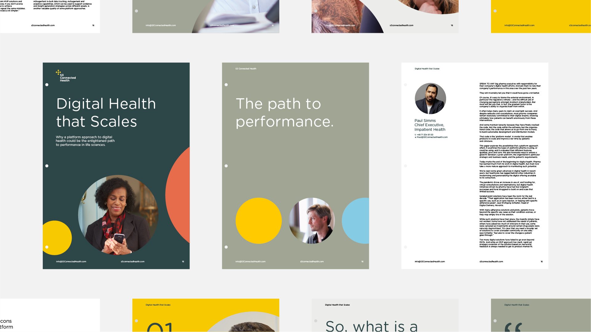
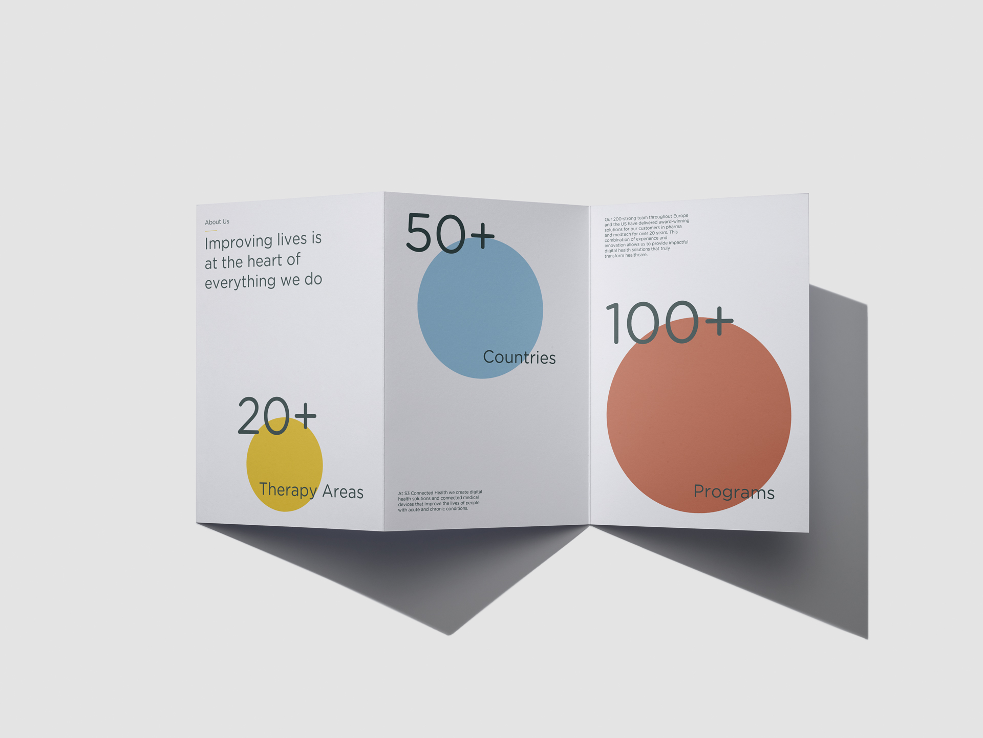
The requirement was for a clear brand strategy and positioning, an evolved brand identity, digital collateral including a new website and wider marketing collateral.
Huddle jump-started the process with a Hack – an intensive, collaborative and creative process we’re becoming famous for. The Hack helped us to identify a brand platform that truly reflected the business’s positioning, while also future-proofing it. With the brand positioning, mission statement and vision for the business in place, we were then able to create a powerful, relevant and engaging brand.
As Danny, founder of Huddle, explains, “The hack was a vital tool, particularly as the team from S3 didn’t have much branding experience. In the early stages of the branding process we sometimes had to encourage them into going along with our recommendations, but the results were worth it: the entire organisation now sees the value of the work that’s been done.”


Pushing the boundaries together
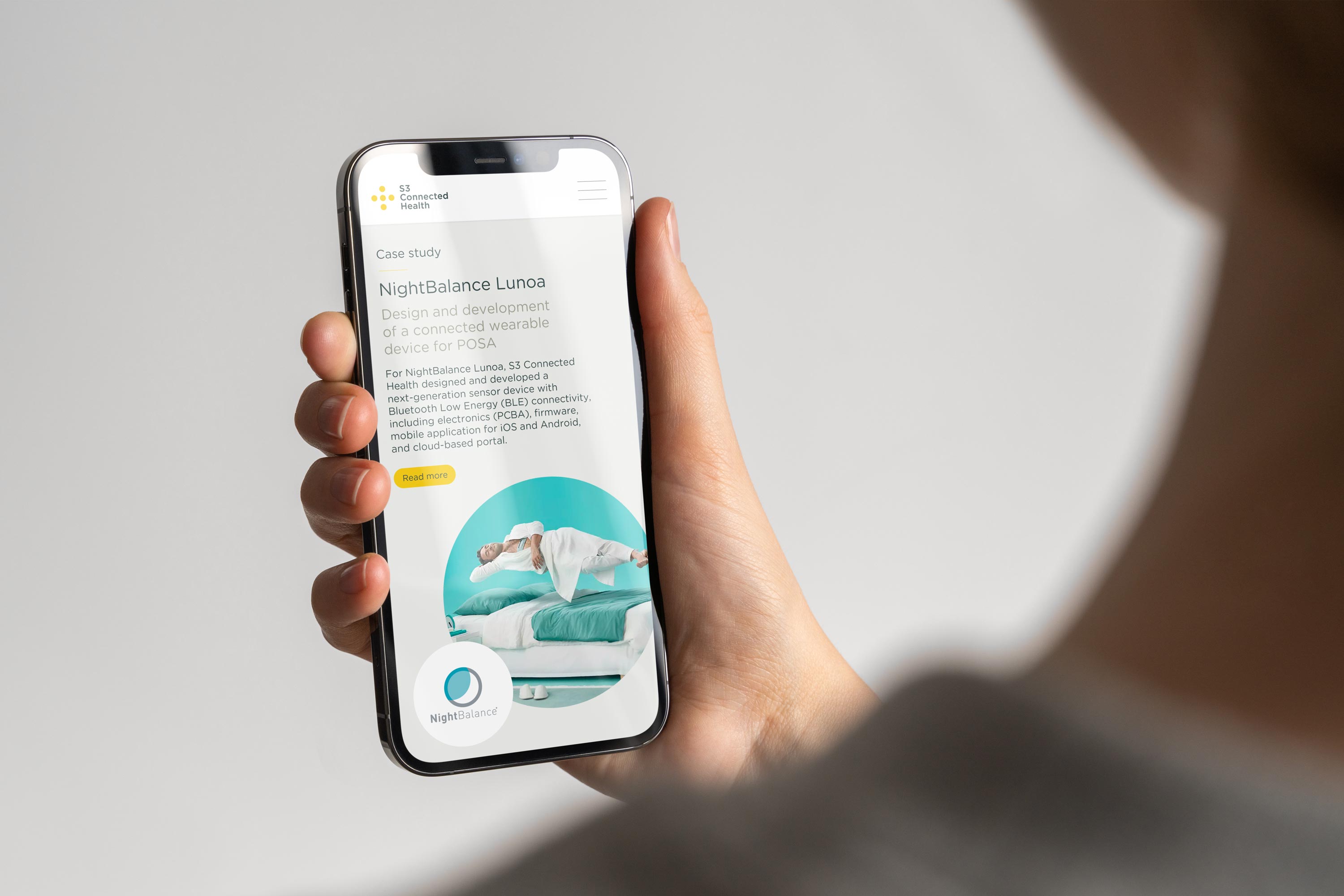
The success of that first hack led to a succession of others, out of which came a string of useful ideas and valuable developments. This included naming their software platform, in the process giving S3 Connected Health a tangible product to market and sell. The newly named Affinial is now an invaluable brand asset and marketing tool: a hero of video, photoshoot and powerpoint decks, and a star turn at exhibitions and marketing events, bringing S3’s offering and capabilities to life.
The visual identity references connectivity with a series of dots. Its primary colour is an optimistic and sunny yellow, said to resonate with the left side of the brain, helping us to find new ways of doing things. This positivity is reinforced by the shape of the logo being a plus sign, or cross, which also neatly represents health; the cross being the universally recognised symbol for medical aid used by pharmacies, the Red Cross and hospitals.