Seeing the wood for the trees
Creating stand out
As a start-up fintech with a unique business model, Aspen wanted to evolve its generic brand positioning and visual identity into a more sophisticated brand that embodies its role as a groundbreaking support service and tool for financial advisors and a progressive business and place to work.

Seeing the wood for the trees
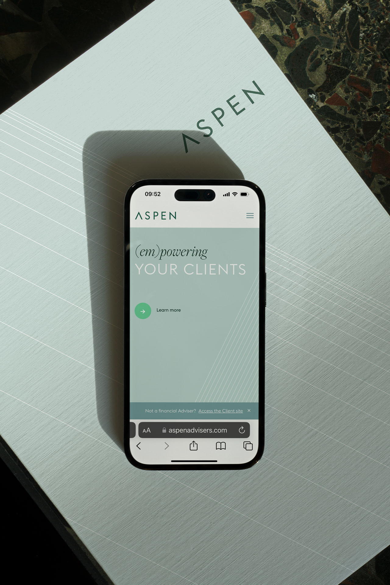
Using our Huddle Hack as our starting point, we developed a clear brand strategy and a clear, smart, differentiating positioning - (em)powering advisors, which evolved into the brand tagline. The considered use of the brackets highlights the dual meaning within the positioning and emphasises the close relationships between Aspen and its clients.
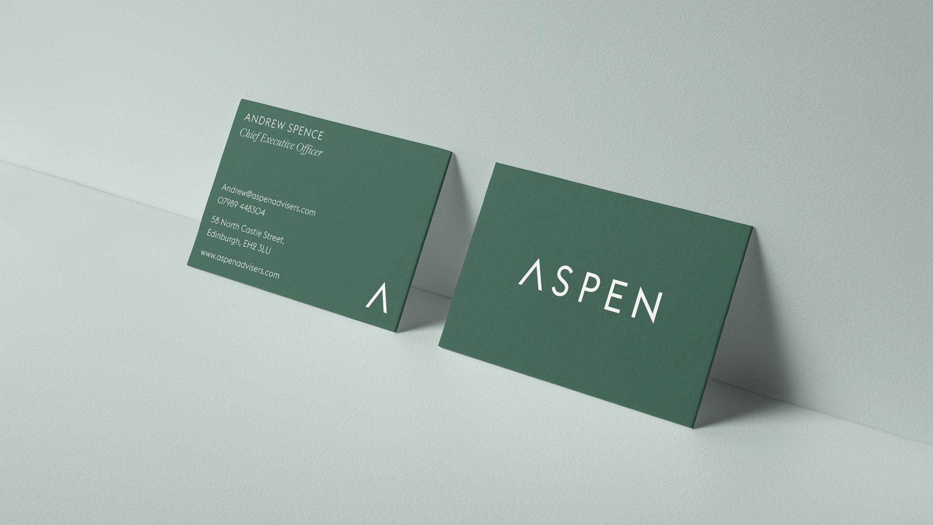
This metaphor was then extended into the visual identity development and the creation of a beautifully refined and modern brand identity. We elected to use both a serif (Freight Display) and a sans-serif (Euclid Flex) for the brand typefaces, this created a harmony between both precision and expertise, qualities that adhere close to the brand. A varied tonal green palette feels assured and grounded, this plays out through both deep and pastel greens. A vibrant brighter green accent also provides cut through for brand call to actions. Strong angular lines are formed from the A of the logotype into a graphic device that flows across the brand collateral. These devices play out in a precise and repetitive manner, mirroring the brands attention to fine detail and considered craft within their field of work.

A breath of fresh air
The new Aspen brand identity has a sharpness and a stature that brings a breath of fresh air into a traditional industry, positioning it firmly as a leading, progressive fintech business that delivers against its revolutionary promises.